Healthcare platform
Reperio: finding the right pharmacy

Date:
November 2020 — April 2021
Roles:
Creative Direction, Design strategy, UX and UI Design, Web Design, Visual Identity, Marketing
Client and sector:
Anonymous / SaaS & E-commerce
Reperio is a digital healthcare logistics platform created to help users find nearby pharmacies and their products. It was an entrepreneur's business idea born out of a personal need during the Covid pandemic. We started from the idea and research, and I designed a clickable prototype (MVP), branding and marketing materials.

Overview
Background & reasoning
Reperio is the working name I've given to a client project completed for a Romanian entrepreneur who requested anonymity. The branding and name shown here were changed for portfolio purposes, but the UX, UI decisions and design process are documented as they were delivered to the client. I was the sole designer on the project, working directly with the client in a two-person collaboration. They brought the business idea, some hand-drawn sketches of early screen concepts, and third-party market research validating the product need. From there, everything else (research interpretation, personas, user journey mapping, wireframing, UI design, visual identity and marketing materials) was mine to own and execute.
The Romanian market was missing a unified platform of pharmacies offering their services. There were several large pharmacy chains offering online services with home delivery, but users needed to individually search these pharmacies if they wanted to compare prices or products.
During the Covid pandemic of 2020, the client observed this lack of unified information available online out of personal necessity (while caring for a sick family member). Given that moving around was restricted and people needed medication and safety products such as masks more than ever because of widespread disease, they identified the need for access to transparent information and an easy option to buy or reserve the products. They favored access to the products as soon as possible, so user pick-up was imagined as a better choice than courier delivery (which can be added to the platform at a later stage).
Business model & steps
Reperio's business model is two-fold, on the one side it’s B2B (Saas), meaning that Reperio as a start-up is selling the platform to pharmacies and charging them commissions when selling their products using the platform, while on the other side it’s B2C (e-commerce), given that the pharmacies can then directly sell to final customers using the platform. At a smaller scale, it’s what large platforms such as Amazon are doing, allowing multiple business to sell on a unified platform.
The project was imagined to have 5 main steps (1 & 2 are relevant at this point):
-
gather & analyse relevant market data about the need for the product (market research study);
-
design an MVP (as an interactive prototype) and basic branding;
-
while showcasing the MVP, get as many pharmacies as possible to join the platform;
-
implement the platform as a website and downloadable app;
-
promotion through marketing campaigns.
The process
Key Challenges & UX Solutions
The Reperio project required balancing strict medical regulations with a seamless user experience. These are the primary technical and logistical hurdles I navigated:
-
The Regulatory Split: Legally, users cannot "buy" prescriptions online, but they can for OTC items. I solved this by designing a hybrid checkout, where Rx items generate a 48-hour reservation code while OTC items proceed to a standard payment gateway.
-
Information Density: Showing 50+ pharmacies with varying stock levels risked user "choice paralysis." I implemented Progressive Disclosure, prioritizing a "Best Match" (Full Availability + Proximity) and using color-coded map pins to simplify complex stock data.
-
Inventory Fragmentation: User journey mapping and initial exploration revealed that users might need to combine products from multiple pharmacies, since a single pharmacy rarely carries 100% of a multi-item list. So during the process, I adapted the design from an initial single-choice pharmacy list in the map to a multiple-choice Selection UI, allowing users to pick partial stock from Pharmacy A and the remainder from Pharmacy B, merging them into one unified checkout basket.

The market research was commissioned by the client through a third-party agency and covered product-market fit, user interest and demand validation across the Romanian market. I worked from the summarised findings — the full methodology and raw data remained with the client — and I used them as the foundation for building user personas and mapping the core user journey.
This was a real constraint of the project. Without access to the complete dataset, my personas were built on the available results combined with my own analysis of the target context — urban Romanian users navigating healthcare access during and after the Covid pandemic.

User benefits:
-
convenience (in comparing pharmacy databases from the comfort of the home/office/etc);
-
transparency (in seeing a comparison of product prices and stock);
-
ease of use (of a clear online platform);
-
immediacy (in getting necessary medical products as soon as possible);
-
certainty (that the product is reserved and waiting for pick-up);
-
ultimate goal is medical ailment as soon as possible.
User conditions:
-
ages: 18 and up
-
access to a device with internet
-
minimum tech savviness
-
mobility to go pick up the products

I conducted research on visual identity inspiration and a comparison of live platforms (UX functionalities, card structure, etc.). This led to a moodboard as a visual starting point and then wireframes.

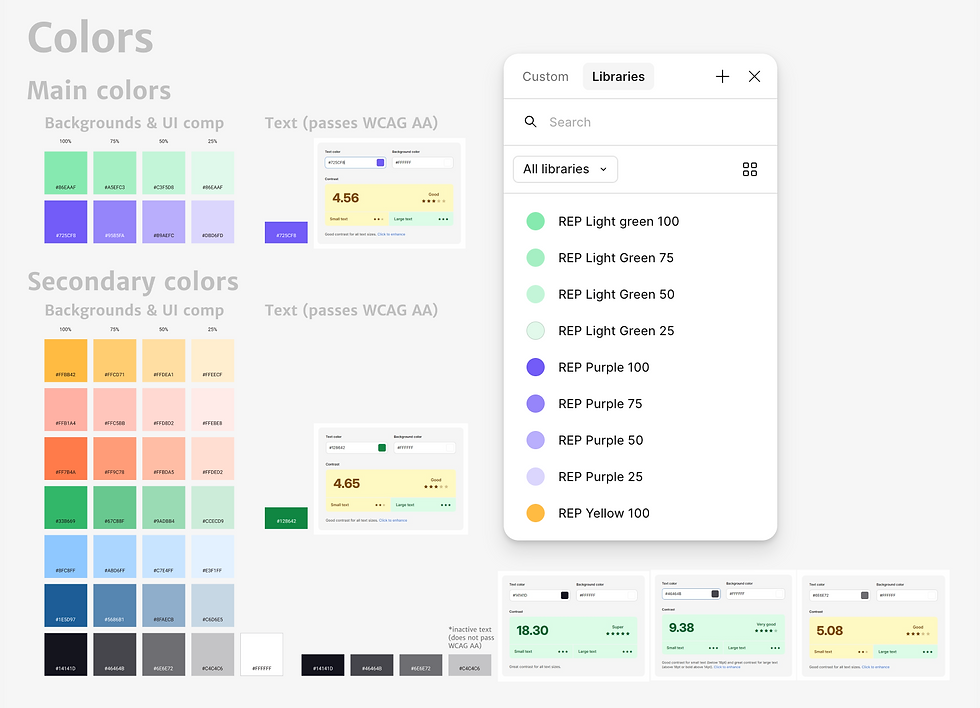

Systems thinking:
Figma is my main weapon of choice for product and web design, and it's also where I create the design systems. For this project I created text & color styles, but also foundation elements such as cards and buttons as components so that they can easily be inserted and updated when required. This also ensures an easier transition for implementation, although for this project I did not go very far in that regard since the potential for implementation was unknown at this point.
Visual identity
The visual direction is deliberately warmer and more approachable than the clinical aesthetic typical of healthcare platforms. I chose vibrant purple for its associations with trust and innovation — appropriate for a new platform asking users to engage with sensitive health decisions — and green to reinforce the health context without leaning into the cold, sterile palette most medical products default to. I imagined the identity to be serious enough to be credible, but light enough not to be intimidating. The two main colors are combined with additional secondary colors with the same intention to lighten up the otherwise serious topic of health.
The type is Merriweather Sans, a modern sans-serif font family perfect for screens with good legibility. It's a free Google font in line with the project's low budget.
The logo symbolises an abstract pill in a digestive tract, while obviously nodding at a map route toward a definite point in a location pin. Reperio is a Latin term, and it means "to find, to realise, to discover". The visual identity is completed by 3D graphics (a mix of self-created and third-party characters and objects) that inspire motion and lightness and guide the viewer's perception in the marketing materials, but also in the platform itself.


Deliverables
Marketing materials
I also designed a few graphics that showcase what the brand looks like out in the open. These include banners & posters, merchandise and social media posts.

Interactive dummy prototype
The main deliverable of this project was the Figma interactive prototype. At the client's choice, this was designed in a desktop format because they intended to showcase it on a laptop while visiting pharmacies to try to get them on board in the next stage of the project.
The above is a video of the user journey through the platform.


Breadcrumbs were used to ensure a transparent and clear process for the user (green highlighting the curent step). Explainer info cards were also added where necessary to eliminate confusion.


Users can choose to display the details and products of a single pharmacy or a scrollable list of all the pharmacies.


Reflection & Outcome
Reperio never made it to production. After I delivered the MVP prototype and marketing materials, the client spent the following year trying to bring pharmacies onto the platform, which was a harder sell than anticipated. Small independent pharmacies lacked the funds or appetite for new software, the bigger ones were happy with their individual online solutions, and without significant financial backing or recognisable partners, momentum on the project stalled.
It was a useful reminder that good design work doesn't guarantee that a product ships. There are structural, financial and market factors that sit entirely outside a designer's control, and recognising that clearly is part of working professionally at this level.
For me personally, Reperio was quite a formative project. It was one of the first times working deeply with UX research constraints and navigating incomplete data while still making defensible design decisions. It was also the first time I had to design for regulatory complexity — the prescription versus OTC split in particular required a level of domain research I hadn't done before. I came out of it with a sharper and more practical understanding of how UX reasoning and UI execution have to work together from the very first wireframes.
