EdTech platforms
FoxEducation & Sdui: designing identity and systems for education across Europe

Date:
February 2022 — September 2025
Roles:
Creative direction, Visual identity, Design strategy, Web Design, Marketing Design, UX and UI Design, Motion Design
Employer and sector:
FoxEducation & Sdui (Seven Education) / EdTech, SaaS
FoxEducation (FoxEd) is one of the most recognised names in EdTech across the German-speaking world. SchoolFox, its flagship app, has over 1.5 million users across 6,500 schools in Europe, sitting alongside KidsFox for kindergartens and preschools, and TeamFox for clubs and groups. In total, over 9,000 institutions across DACH rely on the FoxApps, including the City of Vienna and the state of Lower Austria among their institutional clients. In 2024, FoxEd was acquired by Sdui Group, and the combined organisation grew to serve over 22,000 institutions across Europe and beyond.

Intro
That meant working simultaneously across marketing and product, building and growing a shared brand design system across teams and companies, redesigning marketing websites, producing marketing campaigns, and ultimately leading a cross-functional international design team across four company brands and multiple countries.
I joined FoxEducation (then part of GoStudent) as Senior Visual Designer and stayed through acquisitions and a tumultuous transition into a group of companies, eventually becoming Visual Design Expert and Lead Designer at Sdui Group (now Seven Education). For more than three and a half years, my job was to bring visual coherence to brands and digital products that had outgrown their design foundations.
NOTE: Brace yourself, this will be a long one. Because I worked in these two positions for close to 4 years and performed across so many aspects of design, the tasks and output were extensive. To make it easier and quicker to navigate, you have the option to jump to your areas of interest:
Making it happen
Key Challenges
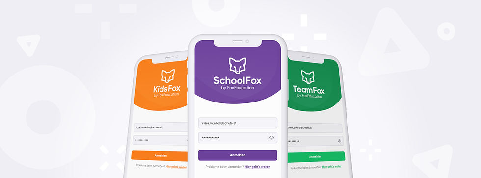
FoxEducation and its digital products had a fragmented visual identity. There was misalignment between how the apps, the marketing website, the sales materials, and the customer support documents looked and communicated. On top of that, the group of companies has multiple brands and sub-brands, each with their own colour schemes, systems, and markets. The colour schemes represented a particular challenge, because although necessary, I was quite limited in changing them, due to their complex interconnectivity with the app environment.
All of the above meant that the Product, Marketing, Sales, and Support teams worked in parallel without a fully shared design language to anchor them, and gaps appeared. My role was created specifically to bridge those gaps
— brand & marketing designer on one side, but also product UI designer on the other, operating across both worlds simultaneously. Also challenging was the fact that in the education sector, stakeholders are used to large amounts of information and explanations, and this was the case for FoxEd as well. App onboarding documents, flyers, and other materials often contained lots of complex information. But I did not let this slow me down, and I found the solution by building a visual identity system with better structuring, layouts, and supporting graphics.
After FoxEd became part of the Sdui Group and I was promoted to lead designer for the group, the challenges multiplied, adding difficult internal communication, very different brands within the group, and many more collaboration nodes.
Audit & Discovery
“Make it happen!” is one of FoxEd’s internal mottos, and that’s exactly what I did. Before proposing anything new, I needed to understand what already existed and where it had drifted.
I audited the company's full visual landscape: the app UI, the marketing website, sales decks, customer support documents, and every recurring asset in between. What I found was a decent foundation, but there was no shared language and no consistency in layout, typography, colours, or illustrations. The audit gave me three clear priorities:
-
find ways to communicate what the apps are all about and bring them centre-stage in the marketing environment, creating a bridge between product & marketing
-
rebuild a cohesive and scalable visual language across all departments (including a new brand style guide)
-
systematically apply the new visual language to all visual assets in the company (including the app UI and the marketing website).
Branding, marketing & campaigns
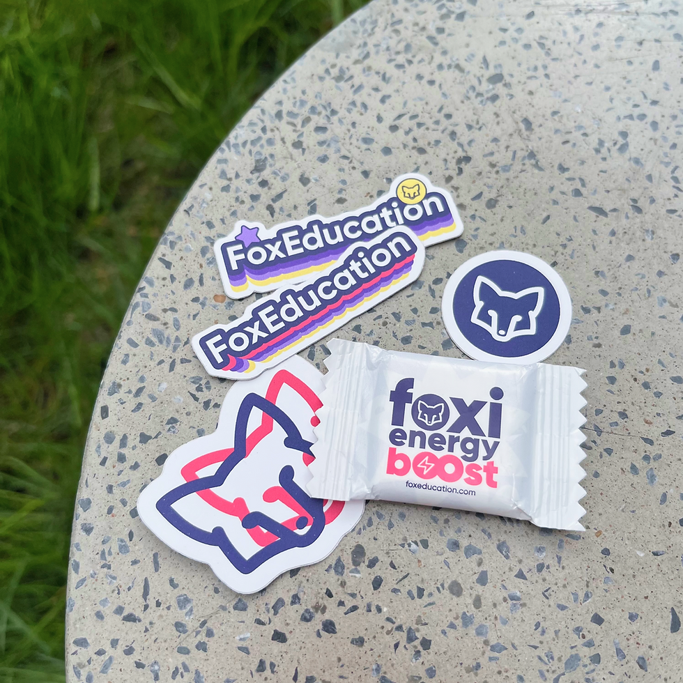
I designed roll-ups, flyers and event materials (fairs, trade shows), merchandise that people want to use (stickers, mugs, clothing), and built reusable template systems that non-designers could use independently. I even did video storyboarding sketching for outside agency animators and illustrators as part of marketing video projects.
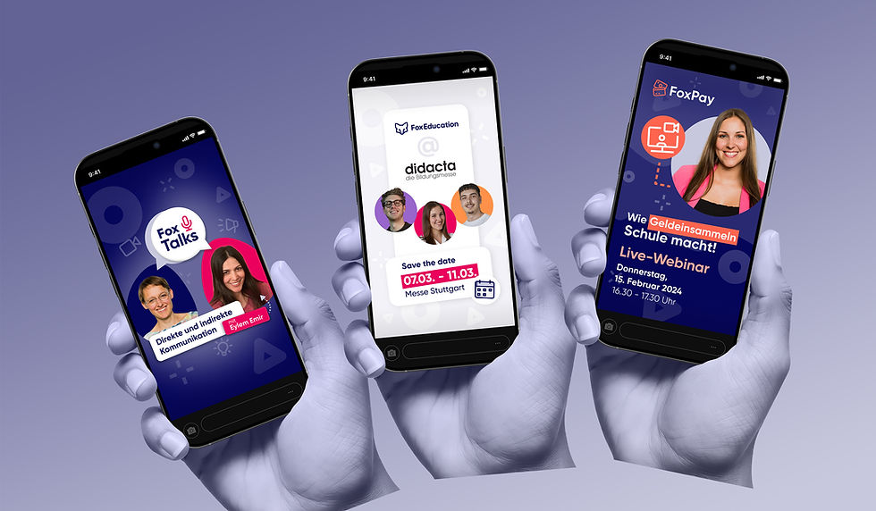
With the first two priorities done, FoxEd now had a refreshed, updated, bold, and cohesive visual identity — more on the transformation here. It was now time to take it to the playground. I designed full digital and print campaigns for new feature launches, ads, banners for newsletters and the blog, produced social media content, and created information documents for thousands of schools.



For the colour schemes, I added better structure when it comes to application (60-30-10) and defined hierarchy and context. Clearly defined shades of gray became the main background colours for many assets, with primary and accent colours in lower amounts.
I added structure to the way typography is used on the website, for social media creation, in marketing and content documents and in any other design asset. This includes scaling based on 8-pixel increases, clear type categories, weights, and pairings.



The campaigns often included new sub-branding with custom illustrations and animations, and a large variety of digital and print assets.
Full marketing campaign creation was a big part of my work, designing campaigns for new digital products and features.




A website with (e)motion
I collaborated within the Marketing department for content and copywriting, and for custom-coded elements, directly with a developer via handoffs in Figma.
The before-and-after difference (as seen here) was significant both in terms of user experience and engagement, with measurable increases in monthly visitors and positive feedback from site visitors - see more details.
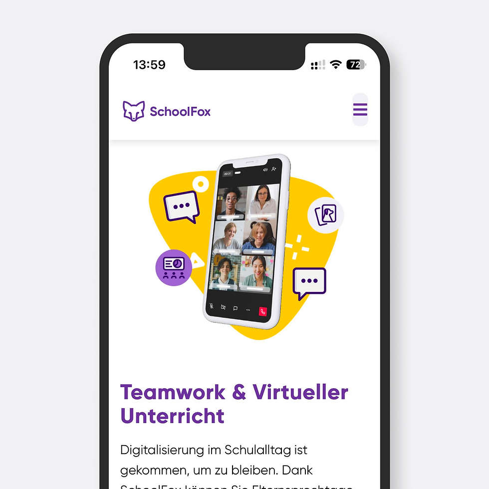
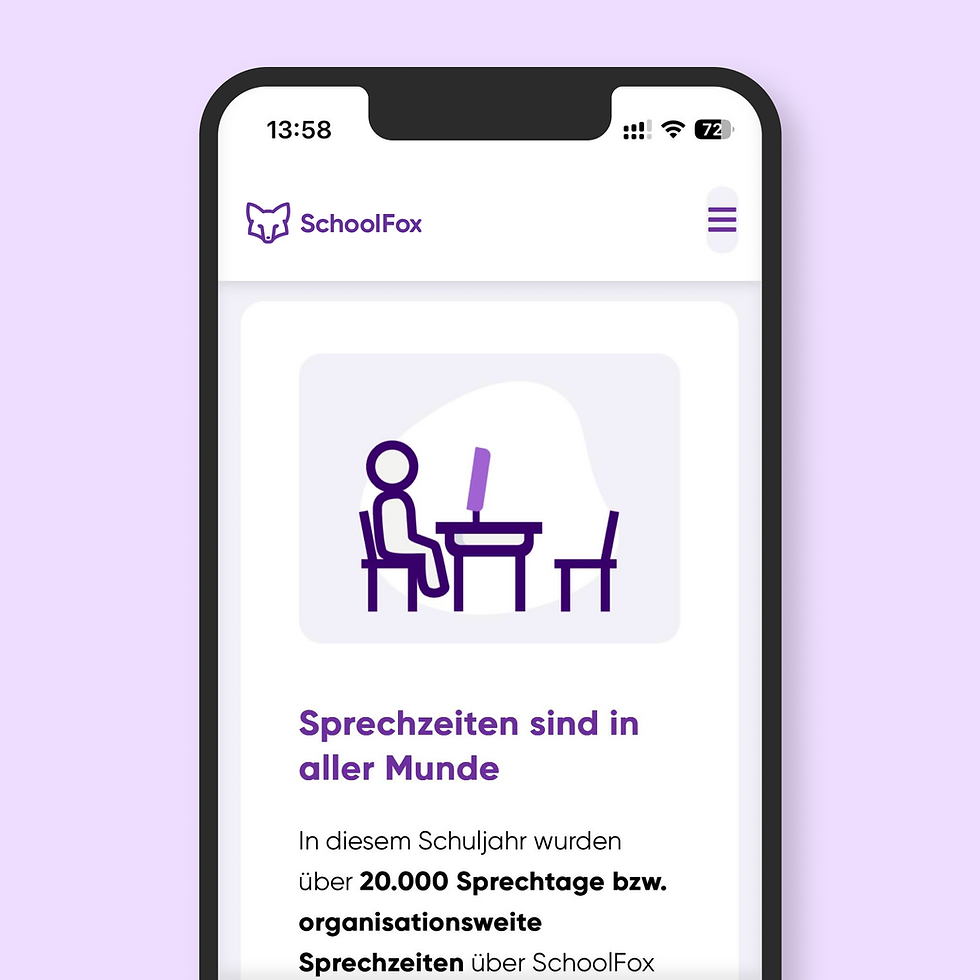
The marketing website full redesign was one of my large projects at Fox. Working in Figma and WordPress, I designed, built, and maintained the new site, moving from a visually inconsistent, template-feeling layout to something that reflected the updated human-centric brand more clearly and integrated the app experience more cohesively. Motion design, playful images, custom illustrations, and 3D shapes can be found throughout the responsive website.


That’s because users of the Fox apps are themselves very diverse, and I intended to convey inclusivity.
When it comes to image selection, I deliberately chose photography that reflected diversity in gender, ethnicity, body type, and ability, rather than defaulting to uniformity.


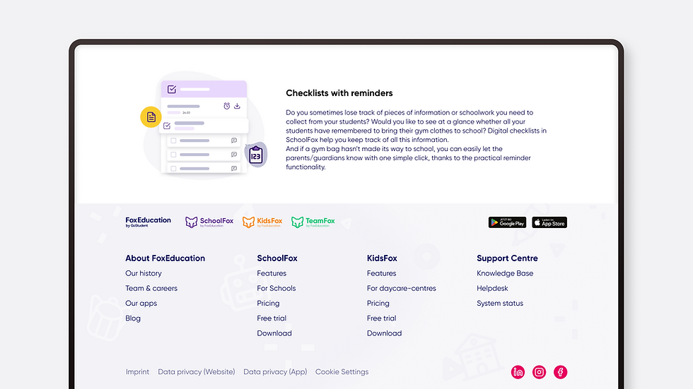
and the Fox site has not been updated or maintained regularly since 2025 — so it may no longer look exactly like the one that I started creating in 2022.
The live website can be viewed here. However, please note that SevenEd started to gradually move content from the Fox site to their main site,
Motion design, video & illustration
Video editing was another part of my role at Fox, and I was always pushing for more motion overall in the brand. One major planned project was the introduction of more motion and new illustrations in the app UI, but that project was halted once Fox was acquired by Seven Education.
Motion design plays a big role in the Fox brand, as you can also see in the sections above. Micro-animations, often coupled with self-made custom illustrations, are placed in key places throughout the website, on social media and in support and sales videos.
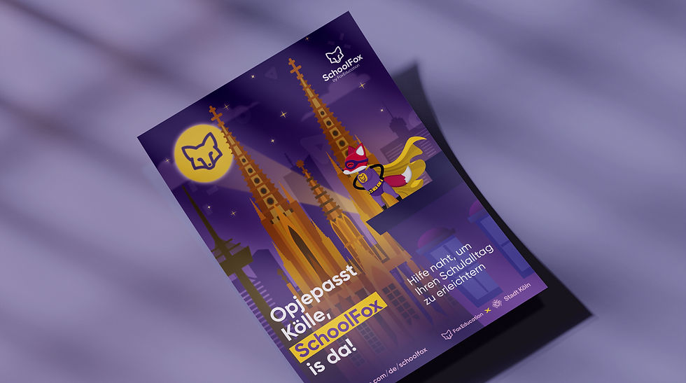
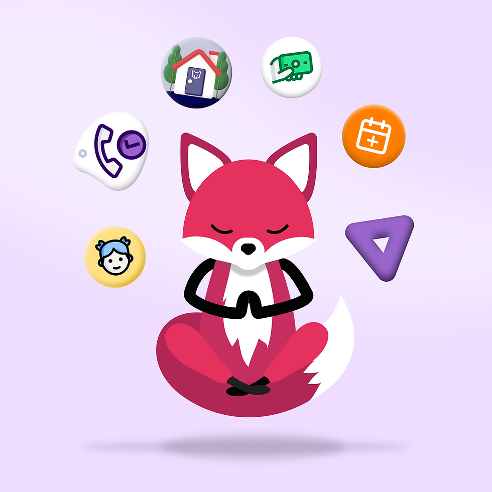

Since it was a beloved character already appreciated by internal and external stakeholders, I kept it, refining it and having fun with its appearances (even transforming him into Batman atop the Cologne rooftops).
Finnigan the Fox (as it was internally named) was part of the initial visual identity as the mascot of FoxEducation, but it was used in few limited poses and contexts.


Product & information design
Product and marketing were finally speaking the same visual language.
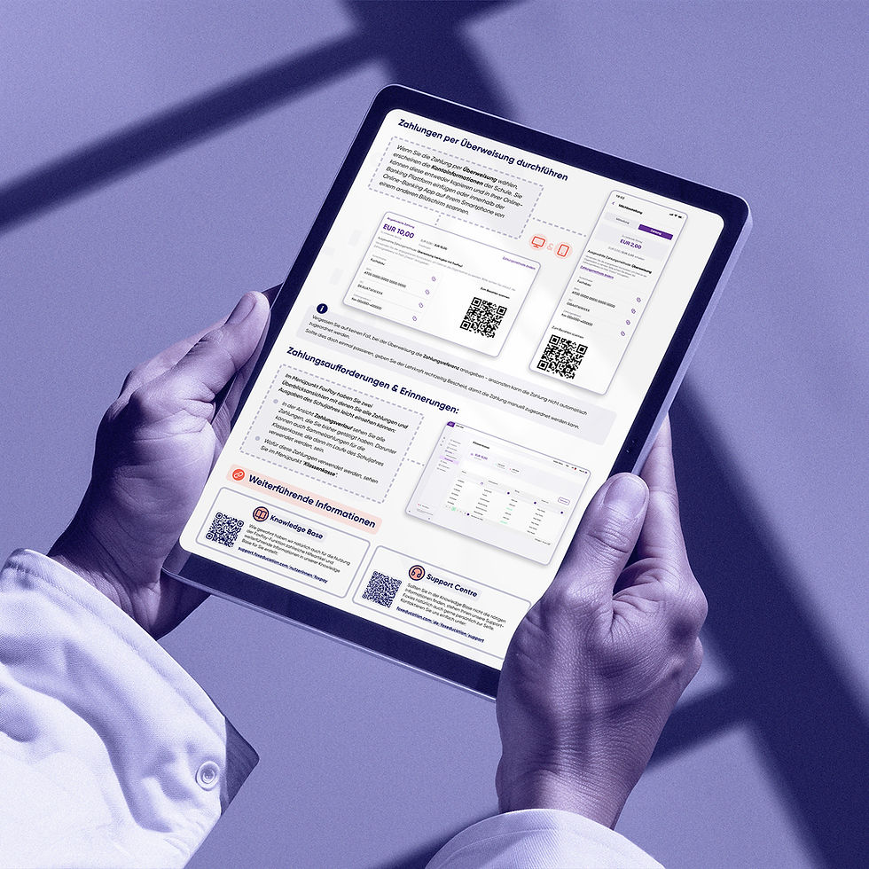
Information design is the practice of presenting information in a way that fosters an efficient and effective understanding of the information, focusing on effectiveness more than aesthetics. And that was my focus as well in designing infographics, onboarding and support documents and sales decks. These were created whenever a new feature was launched, prices were changed or a new partner system integration happened.
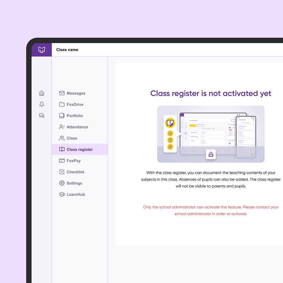
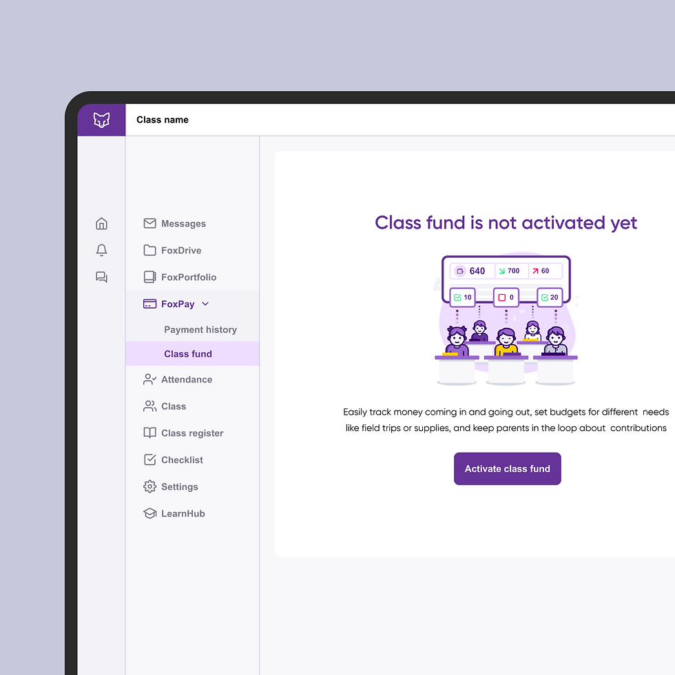
On the product side, I worked directly alongside UX designers and Business Analysts to design UI elements for app features — creating and adapting components within a shared Figma design system, designing new graphics, illustrations & icons, and translating complex data-heavy app screens into simplified visuals that were easy to grasp at a glance.
Those simplified app screens then crossed over into marketing territory, appearing on the redesigned website, in campaign materials, in sales decks, etc.


The Sdui/Seven Education chapter
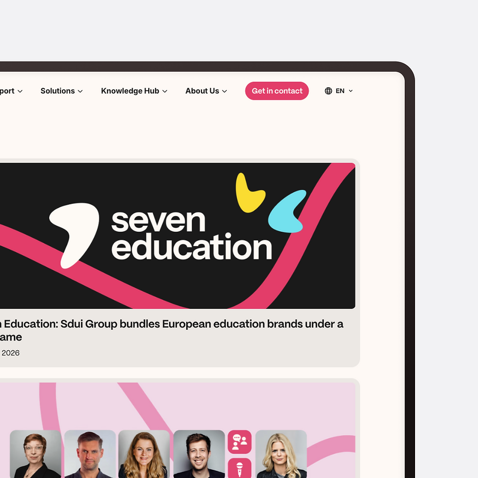
The priority was familiar: audit what existed across all four companies, identify where the real communication misalignments were, and find a common visual foundation that could work across different products and markets without flattening each brand's individual character. This turned into a major project, which I co-led together with the group’s brand strategist, and it involved collaborating on design strategy and fundamentals such as the new logo, colour direction, typography choices, and platform decisions with an ambitious end result: a completely new group-wide brand and marketing website.
When FoxEducation was acquired by Sdui Group (now Seven Education), the design challenge didn't change; it multiplied and grew more complex. Where I had previously worked to unify one company's visual language across departments, I was now looking at four distinct EdTech company brands: Sdui in Germany, FoxEducation in Austria, Additio App in Spain, and Pupil in Switzerland, each with its own design language, separate teams & cultures, and market context. I was promoted to Visual Design Expert and Lead Designer, and tasked with doing at group level what I had done at company level.


This represented a major milestone for the group, which now has a new, refined, and cohesive identity that brings together all the encompassing companies and their platforms.
In March 2026, the group brand project that I co-led was launched successfully, and Sdui Group became Seven Education.


I coordinated output across the group's design needs while continuing to contribute hands-on to projects myself. I also represented the design team in meetings with external partners and agencies, particularly around the new group website built in Framer and internally for constant project updates.
Team leadership was something new for me. The small team I managed consisted of three multidisciplinary designers — an art director/graphic designer, a videographer/photographer & brand designer, and a web & brand designer. I was running recurrent strategy sessions, one-to-ones, and participating in OKR planning and career development conversations.
Processes & work methods
Artificial Intelligence (AI) tools were already present in my work at FoxEd in useful ways to speed up processes, but I never allowed them to step into my thinking or creativity (outsourcing human thinking is a red line that I do not cross). I used LLMs for research & light coding, but I also used built-in generative assistance in tools I was already working with — such as automatic background removal in PS or captions generation in AE.
At the Sdui Group, AI usage expanded for the entire design team and me to even more useful and applied tools, such as meeting transcripts and task allocation in Slack or AI solutions in Notion, plus even more experimenting with and integrating generative solutions such as Midjourney and Perplexity.
The two positions that I held had many requirements, tasks and complexities. This meant that I had to work within clear processes and with effective methods to ensure delivery in a timely manner and keep track of projects. Many of these processes we adapted along the way, as things evolved.
Within the product team, for example, we created clear, step-by-step work processes, in which I first received a briefing on the new element(s) needed (with context: eg. new feature, ideas, etc), I then made at least two proposals (sometimes 3-4), placed them in the app screen mock-ups and feedbacked/tested with the team, adapted if necessary and lastly created the final verticals (always vector format) for all sub-brands.


— edits were easily performed and verified. The Adobe suite was, of course, present for the usual photo editing, small and large print creation (CMYK, bleed, etc), motion design, and video editing. Efficient collaboration and project management were ensured through industry-wide tools such as Slack, Notion, SharePoint, etc.
I worked within the Figma product design system, sometimes needing to expand it with new icons or graphics. Figma was, in fact, my main tool for many aspects of design, using it to create marketing materials whenever digital-only was required (SoMe, info documents, etc) and even illustrations. This ensured good collaboration not just with the Product dep., but also within Marketing


They work together to show a mature but playful brand. All of these elements, plus typical guidelines for colours, type, motion, tone of voice, etc, were compiled into a structured, 90+ page Brand Style guide, with dedicated sections covering application on web, SoMe, and more.
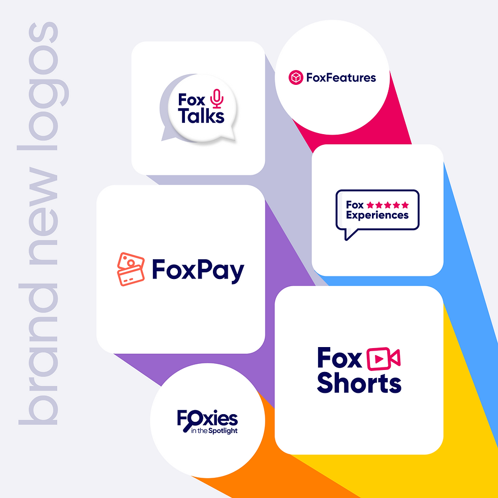
An integral part of working on the FoxEd identity and materials was expanding it with new branding elements, including custom logos that communicate the same design language, illustrations, new icons, and many more. The new visual identity now features images of people paired with flat and 3D graphics, often animated.

Reflection & outcomes
Leading a team was a valuable experience in itself, but it also taught me that I deeply value hands-on production and being close to where it all happens.
It was not all fun and games, and if I were to do it again, I'd push earlier for clearer organizational and individual position structure, more decision-making power for even bigger changes, and closer cross-departmental collaboration, especially right after the acquisition period when institutional knowledge and accountability were at risk of being lost. I'd also advocate more for better internal communication and integrated systems as teams grow and new companies join, rather than letting it remain an informal responsibility alongside everything else.
My time at FoxEd and Sdui Group was never boring, that’s for sure. The workload was consistent and the rhythm was often alert (to say the least). But I have learned a lot and have grown professionally and personally. Even though I produced a vast amount of assets, what I’m most proud of are actually the systems and foundations that tied everything together. I left behind a mature brand, a redesigned website that drove measurable growth, and reusable template systems that reduced design dependency on other teams.
The Sdui chapter added a different kind of learning. One outcome I value from the Sdui chapter is having co-led the visual foundations of the new Seven Education group brand and website.

Impact
Design work is hard to measure in isolation, and I won't overstate my individual contribution to outcomes that were the result of many teams working together. That said, over my time at FoxEducation and Sdui, the numbers moved in the right direction.
FoxEducation recorded 35% revenue growth in 2024 — a period during which the brand refresh, redesigned website, and campaign output were all active and contributing to how the company presented itself to schools, institutions, and decision-makers across DACH.
One outcome I'm particularly proud of is the City of Vienna tender. I designed the pitch presentations and adapted the parent and teacher welcome materials to the City of Vienna's brand guidelines, work that required precision, attention to institutional detail, and a clear understanding of how design builds trust with public sector clients.
The tender was won, making the City of Vienna one of FoxEducation's most significant institutional clients.
The redesigned FoxEducation website drove a 20%+ increase in monthly visitors, and the redesigned support materials contributed to a 35% reduction in support ticket requests. Newsletter redesigns delivered a 30% increase in click rate, combining visual improvements with better content structure to drive measurably stronger engagement. Across the full tenure, the design work touched a user base of over 3 million people across 70+ countries — through the apps, the websites, the campaigns, and the brand materials that represented FoxEducation and Sdui Group at every touchpoint.
Feedback from teachers & other users about the overall design and materials was consistently positive, and that sentiment was echoed internally by colleagues and management throughout my time there.
As the Visual Design Lead on the marketing team, Valentin played a key role in shaping and evolving the visual identity of the FoxEducation brands, and after the merger with Sdui GmbH, those of the entire Sdui Group. His work consistently demonstrated a strong design vision, attention to detail and a deep understanding of how to create visuals that are not only beautiful but also strategically impactful — something I highly appreciated in my roles as CCO and CEO.

Valentin is an exceptionally reliable and diligent colleague who takes a thoughtful, hands-on approach to both the outcome and practical application of his designs.
His calm, friendly, and positive presence makes him a valuable asset to any team or organisation. I look back fondly on the many designs that gained an extra touch of heart, creativity, and fun through his involvement.
